Posts

Statement of Intent draft

Statement of Intent: Website: I will follow to the typical conventions of a DJ’s website: main visual image covering the homepage of which I will use festival type images and images promoting new music to promote the artist as having a good time. links to the social media  a shop  tour dates Furthermore, I will use the artist’s logo throughout all the pages to ensure constant promotion of the artist. Industry: This will appeal to the Universal Music Group as it follows the conventions of its other artist’s websites. Audience: I will ensure that my artist appeals to the 16-25 age group in the AB demographic as the bright colours and festival themes used in the website will attract the audience and keep them interested as that age group are interested in festivals and concerts etc.  Representation: Through my website, my artist will be represented as fun-loving yet not star like, promoting them to be someone you could walk past in the street. Furthermore

Using stereotypes to create meaning for audiences

Image
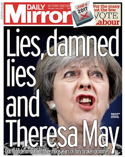
The Daily Mirror depicts Theresa May in a negative light persuading people to vote Labour instead of Tory showing their left wing ideology. This is evident through the very large image emphasising her unattractive side, showing her to be almost like a crook, someone who can not be trusted. The words "lies, damned lies and Theresa May" reiterates this, linking to the well-known phrase "lies, damned lies and statistics". The phrase means that there are 3 types of lies: lies, damned lies and statistics, and so, by stating "lies, damned lies and Theresa May" they are calling Theresa a liar. The Daily Mirror then continues stating "don't condemn Britain to five more years of Tory broken promises". By using the verb "condemn", it gives the impression of punishing Britain to more Tory years. 
Research Task - Dance Music

Image
Dance Music What makes all of these music videos from the dance music genre? The main thing that makes all of these videos part of the dance music genre is that the music is dynamically produced so it is natural and easy to dance to, even if it is the smallest move. Furthermore, this is emphasised in the videos as they all have people dancing in them encouraging people to do the same. Most dance genre music videos also use very simple dance moves so the audience can do the same moves. In addition to this the videos are full of bright colours and bright clothing, as well as recognisable brands.  Explore how the artists are using representation to appeal to their target audience in these three videos by picking out key frames from the video to analyse. All three videos are based around teenagers of all diversities doing something which everyone does - dance. This then appeals to their target audience as its the exact same people used in the videos. The videos are all set in

Pre-lim H&M advert & evaluation

Image
How organised were you as a group? What elements of organisation were vital to you as a production group? As a group, we were well organised most of the time resulting in the majority of the shots being completed. We used our class time effectively to complete many of the shots and the editing showing our organisational skills. However, it is not complete and so obviously time management could have been better for some people.  What technologies did you use and how did they serve to develop your skills as a media practitioner? To film our shots we used an iPhone 7 plus. From this, we exported our videos on to one drive something which few of us had used before therefore developing our skills. Furthermore we used iMovie to edit our video, something which I personally had never used before. We each had to edit the video therefore developing our individual media skills. How creative do you think you were during this process? What elements of the project required creativity and im

Evaluate my initial footage

Image
Framing - comment on the framing of your shot in comparison to the original. Could it be improved? Why do you think the professional shot is so successful? In the initial shot the camera man uses a tripod to create a steady and well organised image where by the three by three rule can be applied, with the subject of the image filling at least  two of the possible nine squares. We could not recreate this perfectly due to the lack of equipment that we had on hand. In the shot we tried to frame it exactly thereby following the three by three rule of cinematography, which hence creates a professional, aesthetic shot. Lighting - does your lighting work. What kind of set up have you tried to use or did you rely on ambient lighting? Why do you think the professional shoot used the lighting it has? In our recreational sot we could not create the intimate and dark lighting in the original shot. This is due to the lack of natural lighting which is seen in the original shot. This

Just.

Image
I chose the name 'Just.' as it is short and snappy, whilst also appealing to the 16-25 ABC demographic. It is also a synonym for fair, emphasising the fair-trade element. My slogan 'Be Fair.' was chosen for the same reason. For my photoshoot I am going to use a factory setting as the location as it shows the working conditions of those involved in fair-trade. I will be using both a female and male model of 16-17 years age to appeal to the audience. For my adverts I hope to follow original conventions of billboard posters, having the logo and slogan across the image. My advert will link to the brief by using the location of a factory to incorporate fair-trade values. The factory resembles the working conditions of the fair-trade workers, as I will edit the factory to be dark and dirty. By doing this, it is the focal point of the advert clearly meeting the brief. The name of my brand is 'Just.', a synonym for fair emphasising the fair-trade focal point. Fur